Nothing gets the internet angrier than a brand changing its logo, even if the brand never mattered to them in the first place.
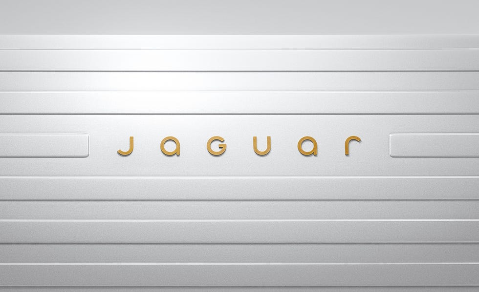
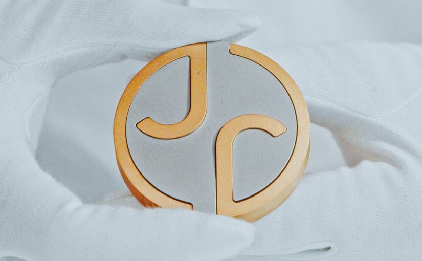
A couple of weeks ago, one of my Discord mods posted a link to Jaguar’s new logo design, hoping to get my reaction. The original Jaguar logo featured an illustration of its eponymous jungle cat with a sleek all-caps word mark in a futurist, wide-width typeface. The new logo has driven its cat to extinction, replacing it with a yin-yang double-J monogram paired with a minimalist, mixed-caps word mark. At first glance, it evokes the era of info-tech more than it does the age of 20th century luxury cars – a clear attempt to shed the stymied aura of old money and invite a new generation of wealth behind the velvet rope.

Like most reactions on the internet to a rebrand, mine was dependably knee-jerk and cynical. “It’s bad,” I said, “and people will forget they ever cared three months from now.” Time will tell if that second part is true, but I quickly walked back the first part of my keyboard curmudgeon statement in favor of something more nuanced.
For one thing, nothing in brand design is good or bad, at least not on a universal scale. Sure, it can fail to meet some practical requirements, like being too detailed for manufacturing or too indistinct for market positioning. But the scales that people use to judge a logo are weighted by culture, experience, and taste – and these vary wildly between individuals. The best one can do is fashion a logo that feels true to the brand’s narrative and tweak it to suit the palate of the target customer.
I will say, the new logo does embody the story of “exuberant modernism” that Jaguar is proclaiming through this rebrand campaign. The subtle defiance of capitalization norms, the occasional diagonal slashes on otherwise right-angled tails, even the absence of the jaguar illustration itself – all of these feel like decisions made to buck tradition with newfound creative energy.
Is this the right move for Jaguar? My guess is, it couldn’t hurt. Like most luxury brands, Jaguar sales have slumped considerably since the pandemic, so it behooves them to at least paint their brand with a fresh coat of innovation, if only for the sake of cosmetics. At least it’ll dominate a PR cycle in time for holiday shopping.
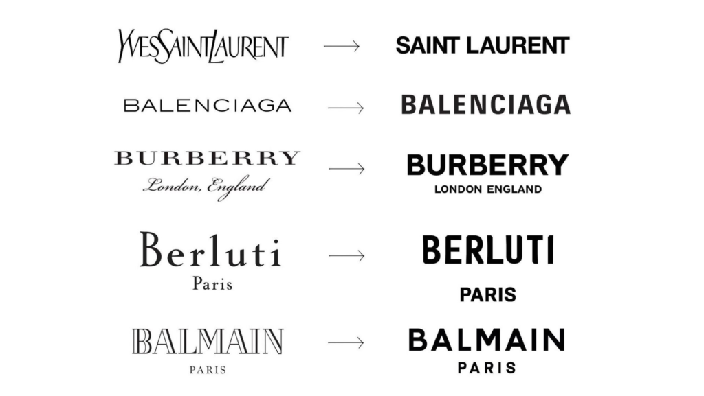
But on the whole, the change leaves me with aggressively shrugged shoulders. For one thing, this ubiquitous move towards bland sans-serifs is just boring. I feel like it started with Silicon Valley juggernauts shaving their logos down to what could be digested on a smartphone screen, and every other industry has felt like they had to follow suit. Maybe it’s the canary in the coal mine of an economy so dominated by tech and finance that every logo feels like it could be for a startup SaaS company.

For another, poaching the illustrated jaguar in favor of a monogram feels like a lateral move at best. I can see the monogram functioning well as an app icon or a hood decal. But there’s another shape that would’ve fit those functions equally well: the silhouette of, you know, a jaguar.
But the biggest reason for my blase is simply this: for most people, a luxury brand is not a purchase but an aspiration. It’s a thing only a lucky few will own, and the rest of us only serve to reinforce its psychological value with others by salivating over it. The new logo deprives the brand of its head-turning feline iconography, draining it of the signaled status its driver wished to convey. And in the end, none of this means anything. Because I’m the proud owner of a 2018 Toyota Camry.
Anyway, see you next time we’re upset about a brand neither of us can afford.

