The open internet might be dead, and Google might have killed it.
Last week my coworker sent me a TechCrunch article about how Google Search, at least as we’ve known it for the past 25 years, is over. At the most recent Google I/O conference, Google announced an “intelligent search box” that, for an increasing number of inquiries, will use AI to generate not just responses but entire UX/UI modules. Gone will be the classic ten blue links, although they’ve been so buried under sponsored results and LLM summaries for the past decade that, in all practicality, they’ve been suffocated already.
The implications for the internet as a whole seem pretty dire. Google spent ages suppressing other indexing sites, absorbing parallel entities and paying companies like Apple $20 billion a year to make Google the default search engine in Safari browsers. The result was Google Search becoming the gatekeeper for most internet traffic. And in short order, they will be closing those gates, demolishing the digital roads we’ve built over this past half a century, and using the scrapped asphalt to build their own giant cul-de-sac.
People are talking about this in apocalyptic terms, and I tend to agree. This is an internet where the world’s most dominant search engine no longer does what a search engine does, which is link out to other sites. Instead, it siphons data—and with that data, value—from all of us who make content on the internet. And I mean all of us, everyone from influencers and journalists and artists, to senior marketing staff at Fortune 500 companies. We all become serfs toiling in the fields that, whether we like it or not, our liege lord Google will reap for themselves—with no guarantee they will share in the harvest.
The age of the “clickless” search is upon us. Unless internet users claim greater agency over what search engines they use, the act of building, maintaining, and supplying content for a site will just be stocking a warehouse for which Google is the only vendor.
Ironically, if we indulge this avarice from Google, it will destroy the incentive to create on the internet in general. The less traffic going to our websites, the less content we’ll likely create for those sites, and the less food the hungry maw of Google will have to feed on.
The open internet might die. But if it does, it might just take Google with it.
Since the pandemic, I’ve become super paranoid about coughing in public. It doesn’t matter that years of working as a bartender have trained me like Pavlov’s dog to bury my face in my elbow when I feel the slightest tickle in my throat. Now I’m afraid that any cough, no matter how sanitary, is going to cause heads to swivel and start screeching at me, like I’ve awoken the bodysnatchers.
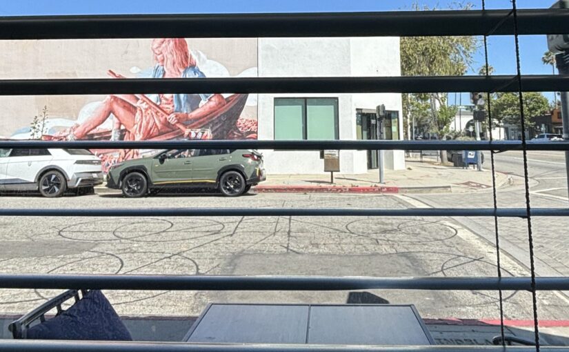
I’m staying in Culver City for the next few weeks, settling on an apartment in Los Angeles for an upcoming job transfer. Today I was at a coffee shop, typing away on a PowerPoint for work, when I felt the ol’ throat tickle.
I’d forgotten just how dry Southern California is, and my late afternoon latte was not hydrating me the way it should. Not to mention I’d just gotten over a cold. I needed more than just one cough. I needed a cornucopia of coughs. A veritable smorgasbord. A whole Thanksgiving feast of them.
The shop was about to close anyway. So, while the tickle in my throat became a rapidly growing bramble patch, I calmly shut my laptop, placed it gingerly in my backpack, and slid quietly off my stool. As I did, the bramble patch caught fire.
The noise that emanated from my chest was incomprehensible, like being confronted with a visage of the Holy Trinity. It had the resonance of a burp, a hiccup, and a sneeze—embodying none of those sounds and all of them at once. If I had to summon it again, I don’t think I could.
I didn’t stay long enough to see anyone’s reaction. For all I know, nobody cared. All I know is, even as I move back to Los Angeles, a city that can make you very conscious of personal appearances, I will try to remain true to myself, even at the risk of being a hacking gremlin.
A couple of winters ago, I flew home to Boston after a long business trip, sometime after the holidays. It was past midnight, and buses were no longer going to New Hampshire, so I got an Uber to a nearby hotel. The driver was playing a genre of music I haven’t heard since I darkened the doors of evangelical churches when I was younger. It was Contemporary Christian Music, the kind that escapes genre classification, somewhere between a defanged version of U2 pop rock and the saccharine tunes an insurance company might play over an employee training video.
But this recording felt different. It had a crackle to it, like someone ruffling cellophane in the microphone. The voices were breathless and drenched in reverb. Each consonant in the lyrics felt clipped and eroded like a sandblasted cliffside. The vibe was metallic and otherworldly. It felt inhuman.
It took me a chorus, but I figured out this was AI-generated worship music. I said nothing to the driver, since we’d said nothing to each other up until that point. It was none of my business what he listened to in his car. But the music felt profane to me, even as an agnostic.
I don’t sing worship songs anymore, but I know many people who do. There’s supposed to be something sacred to worship songs, even in evangelical churches, where the values and aesthetics of American consumerism tend to water down their potency. Still, when I was a churchgoing kid, I had reasonable certainty that, whether I was singing an old hymn or a CCM hit, a person with a soul devoted to their God had crafted it for me, hoping I could use it to convey the same divine rapture they felt as they wrote it.
No more of that, I guess. In this car, there was no divine connection being offered, just the numbing tones and milquetoast lyrics of a predictive language model. Maybe these computer outputs were bringing the driver closer to God. The computer, however, didn’t give a damn.
This week, my friend and Twitch mod Harukio recommended this video by Adam Neely, exploring Suno AI, the foreboding reincarnation of Italian futurism, and the potential death of recorded music as a medium. I think it’s required watching for anyone who wants to weigh the price of AI-generated music to our brains, our social circles, and our politics. It brought that Uber ride to mind. Thinking of a song as just a unit of consumption drains the blood from it. And we are in the age of digital vampires.
If you’re tired of being drafted into America’s culture wars, too bad. Now you’ve got to pick sides between two default fonts in Microsoft Word.
I’m sorry it’s not Comic Sans and Wingdings. A war between those two would have been a lot more fun to watch, like a birthday clown fighting the aliens from Arrival.
No, we’re talking about the most boring fonts on the planet, Times New Roman and Calibri. You may recognize Times New Roman from the recurring nightmares you have about writing your college essays. Calibri is the one you see in the living nightmare of your current nine-to-five job. Two different fonts, same existential malaise.
But the United States government seems to think one is better than the other, and for the dumbest possible reason.
Rubio cited budget concerns, saying that switching to Calibri cost taxpayers $145,000. Although, does he think switching back to Times New Roman will reverse the cost? It’s not a light switch. That’s not how money works, lil’ guy.
No, the real bogeyman for Rubio is three letters having to do with accessibility. He attributes Blinken’s shift to Calibri as a misguided attempt at (say with me now) diversity, equity, and inclusion.
That’s right, liberals. Fonts are DEI now. Calibri is woke.
Now, you might be thinking to yourself: what the fuck is anyone even talking about anymore? Why are we fighting over fonts? How bad has partisanship gotten in America that a dropdown menu in a word processor is as divisive as the Mason-Dixon line? Are we about to draft Clippy into a civil war? We told him to fuck off so many times, let him retire already.
Yes, debating between Calibri and Times New Roman would be very stupid. Kind of.
So, this all boils down to how easy fonts are to read. The legibility of fonts has been a debate for decades, and much of that debate centers on serif fonts versus sans-serif fonts. Serifs are the little strokes you find at the end of the big strokes, like little feathers at the end of letters. Sans-serif just means no serifs; the feathers have been plucked.
For a long time, the conventional wisdom was that serif fonts were better for reading. Bottom serifs usually corresponded with the baseline of the font, and in theory, this helps your eyes keep track of the current line you’re reading, especially with large bodies of text. It’s sort of like bowling with the bumpers up, if that were acceptable for a fully grown adult.
But the digital era brought the dominance of serif fonts into question, as many programs and websites made sans-serif fonts more prevalent. In fact, the preference for serif fonts may have just been a long-standing cultural bias. A study of elementary school kids in 2002 found no significant difference between serif and sans-serif fonts when it came to reading speed. However, the students did express a strong preference for Comic Sans. Bookmark that, we may come back to it later.
Other studies have shown that it’s more than just serifs that determine legibility. One recent study in 2022 suggests that it has more to do with stroke contrast – in other words, how much difference there is between the thickest and thinnest parts of the letter. (There’s a joke to be made here about being able to see curves from across the room. Somebody else can make it on my behalf.) All that to say, there are likely more characteristics than just serifs that make a font easier to read.
Why do I mention all this? Because to me, the debate between Calibri and Times New Roman isn’t one about what font is more legible than the other. If it were about legibility, politicians would leave the matter to scientists, and given the current body of research, the answer might not be as conclusive as one might prefer.
No, the reason this debate sent me down a rabbit hole is because it feels reflective of so many debates between self-described conservatives and liberals, the neverending battle between bad faith and good intentions.
I have no doubt that when the State Department changed its font to Calibri, somebody in Secretary Blinken’s employ did some precursory research into the usability of fonts. Is it substantiated by the data? Someone with more than a Bachelor’s degree in English and a 3.2 GPA on their college transcripts will have to let me know.
But responding to that change by evoking the spectre of DEI is completely disingenuous. It would be okay for Secretary Rubio to simply say, “I don’t like Calibri, I like Times New Roman.” It would make him the dullest person on the planet, but at least he’d be honest. Blaming the switch on DEI is cynical pandering to a shrinking base of zealots. It’s farting into the wind for a dwindling crowd of people who love the smell of farts. (Not that I’m kink shaming.)
Now, in this case, the appeal to DEI fears is borderline innocuous, but not entirely. If you’re lucky, you will have to deal with legibility issues eventually, because all of us want to live long enough for our vision to go to crap. As a comedian with cerebral palsy Josh Blue says, people with disabilities are “not only the largest minority group, but we’re also the only minority group that you can join at any time.”
My point is, decisions like these could affect you directly, either now or in the future. I’m not advocating for Calibri. I would rather print 50 Shades of Grey on sandpaper and have to read every word aloud as I ate the pages, than go to bat for a font that’s just Helvetica in a bad toupee. But I am saying that if the administration can be this cavalier about a range of conditions that can affect anyone, imagine what they’re doing to disadvantage the most vulnerable among us.
Even as I was writing this essay, the Department of Health and Human Services cancelled millions of dollars of research grants to the American Academy of Pediatrics, a frequent critic of Secretary RFK, Jr. These grants were meant to fund research into things like SIDS, fetal alcohol disorders, and early autism detection. When the department sent them a letter to cancel those grants, guess what they evoked as their justification? DEI, their evergreen scapegoat.
Look, changing the font of government letterhead does not matter in the grand scheme. But the reason for changing it does. It reveals the heart of certain bureaucrats who do not see government as a service to its people, and are instead obsessed with nothing more than image maintenance. Accessibility may not matter to you now, but one day, it will. And when that day comes, you better hope that your elected officials have your back, instead of brushing you aside because you no longer fit the narrative.
Anyway, it would feel unsatisfying if we left the war between Calibri and Times New Roman in a stalemate. So, if we absolutely have to choose between them, I propose we change the official font of all governmental agencies to…
Comic Sans.
Oh, you thought I was kidding about that bookmark? I’m serious, all government correspondence should be in Comic Sans. Let me list the reasons.
First off, hilarious.
Second, in terms of usability, there is at least anecdotal evidence that Comic Sans is helpful for people with dyslexia. The actual research is less conclusive, but again, we’re talking about delivering a subpeona and it’s same font as the hangtag for Beanie Babies. Shut up, nerds, we’re having fun.
Third, can you imagine how terrifying we would be to our enemies if we were typing up sanctions, treaties, declarations of war in Comic Sans? Those are some unhinged psyops right there. Sure, we’d look like a country full of whimsical PTA moms printing flyers for a bake sale – but you know those moms can turn on a dime.
This will be my one and only agenda if I’m ever elected to office. And that doesn’t make America a better place, there’s always Wingdings.
Recently Pantone announced its 2026 Color of the Year. It’s Cloud Dancer, a cold, bland, hueless TCX color, and it’s bad, and I hate it. So I roasted it 25 times (because I thought it was the color for 2025, and it’s possible that I can’t read).
You look like if Taylor Swift was a CMYK value.
You look like a discontinued brand of urinal.
You look like a wine mom’s porcelain veneers.
You look like Casper the Friendly Ghost Kitchen.
You look like Millennial Beige if it could finally afford a mortgage.
You look like a dingleberry on the butt of the AI slop version of the Coca-Cola polar bear.
You look like the liminal space inside the head of a protagonist in an A24 film.
You look like you should be taking vitamin D pills.
You look like the walls of an asylum after it was bought by private equity.
You look like the inside of a gym sock after a young man growing up in the 90’s discovers the Sears lingerie catalog.
You look like Jim Gaffigan’s elbows.
You look like the White Album if the Beatles were from Scottsdale, Arizona.
You look like I wish I had actual snow blindness.
You look like you smell like rubbing alcohol.
You look like that chalky powder that tech bros drink because they’re no longer capable of feeling hunger or love.
You look like you hate those filthy hobbitses.
You look like the twins in the Matrix sequels.
You look like the kind of person who uses the phrase “circle back” in an email.
You look like you ate crayons as a kid but only because you didn’t want any of the other kids to use them.
You look like what a Milk Dud should actually refer to instead of a beloved chocolate candy.
You look like if I painted you on a canvas and displayed you in the MoMA, I would be rightfully hunted for sport.
You look like the favorite color of the guy who changed HBO to HBO Now to HBO Go to HBO Max to Max and then back to HBO Max again.
You look like male lactation.
You look like a hedge fund manager spent hours deliberating between you and several other shades of eggshell white before doing a line of cocaine and screaming at his contractor to paint the BDSM room of his Manhattan condo.
Finally, you look like you were invented by a company that puts a velvet rope around simple color management with its overpriced color books and manipulative SaaS model–wait, that’s not a roast, that’s just a true thing.
Anyway, this sucks, nothing is genuine, everything is rage bait, and the internet is a dead medium. Happy New Year!