Does the Jaguar Rebrand Matter?

Nothing gets the internet angrier than a brand changing its logo, even if the brand never mattered to them in the first place.

A couple of weeks ago, one of my Discord mods posted a link to Jaguar’s new logo design, hoping to get my reaction. The original Jaguar logo featured an illustration of its eponymous jungle cat with a sleek all-caps word mark in a futurist, wide-width typeface. The new logo has driven its cat to extinction, replacing it with a yin-yang double-J monogram paired with a minimalist, mixed-caps word mark. At first glance, it evokes the era of info-tech more than it does the age of 20th century luxury cars – a clear attempt to shed the stymied aura of old money and invite a new generation of wealth behind the velvet rope.

Like most reactions on the internet to a rebrand, mine was dependably knee-jerk and cynical. “It’s bad,” I said, “and people will forget they ever cared three months from now.” Time will tell if that second part is true, but I quickly walked back the first part of my keyboard curmudgeon statement in favor of something more nuanced.

For one thing, nothing in brand design is good or bad, at least not on a universal scale. Sure, it can fail to meet some practical requirements, like being too detailed for manufacturing or too indistinct for market positioning. But the scales that people use to judge a logo are weighted by culture, experience, and taste – and these vary wildly between individuals. The best one can do is fashion a logo that feels true to the brand’s narrative and tweak it to suit the palate of the target customer.

I will say, the new logo does embody the story of “exuberant modernism” that Jaguar is proclaiming through this rebrand campaign. The subtle defiance of capitalization norms, the occasional diagonal slashes on otherwise right-angled tails, even the absence of the jaguar illustration itself – all of these feel like decisions made to buck tradition with newfound creative energy.

Is this the right move for Jaguar? My guess is, it couldn’t hurt. Like most luxury brands, Jaguar sales have slumped considerably since the pandemic, so it behooves them to at least paint their brand with a fresh coat of innovation, if only for the sake of cosmetics. At least it’ll dominate a PR cycle in time for holiday shopping.

But on the whole, the change leaves me with aggressively shrugged shoulders. For one thing, this ubiquitous move towards bland sans-serifs is just boring. I feel like it started with Silicon Valley juggernauts shaving their logos down to what could be digested on a smartphone screen, and every other industry has felt like they had to follow suit. Maybe it’s the canary in the coal mine of an economy so dominated by tech and finance that every logo feels like it could be for a startup SaaS company.

For another, poaching the illustrated jaguar in favor of a monogram feels like a lateral move at best. I can see the monogram functioning well as an app icon or a hood decal. But there’s another shape that would’ve fit those functions equally well: the silhouette of, you know, a jaguar.

But the biggest reason for my blase is simply this: for most people, a luxury brand is not a purchase but an aspiration. It’s a thing only a lucky few will own, and the rest of us only serve to reinforce its psychological value with others by salivating over it. The new logo deprives the brand of its head-turning feline iconography, draining it of the signaled status its driver wished to convey. And in the end, none of this means anything. Because I’m the proud owner of a 2018 Toyota Camry.

Anyway, see you next time we’re upset about a brand neither of us can afford.

Temples

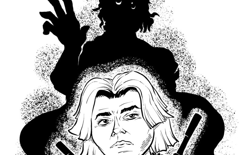
When I was a kid, I hoped that I would grow temples of white hair like Reed Richards from the Fantastic Four as I aged. I got them — along with a widow’s peak as sharp as a letter opener.

My hair was always wispy, even at its thickest. I buzz it all now. I like the feeling better, not so tussled by the wind or tickling on the scalp. It’s less to manage, less to restyle after being matted down in a beanie during the New England winters.

I’m fortunate to have a nice, round head. It made me a shoe-in for the lead in You’re a Good Man, Charlie Brown when I was in college.

I also buzz it because my hair only wants to fall to one side. The follicles grow like a crew without sea legs, leaning too far starboard and leaving the boat feeling lopsided.

But I miss the white temples, which are translucent with my hair this short. I’m sorry, Mr. Fantastic.

I wonder if I was in a rush for white temples because the people around me seemed to need me to be old more than they needed to be young.

I felt like people needed me to be a Reed Richards. Not just smart but genius. Not just flexible but elastic. Not just durable but indestructible.

When I look in the mirror, I see a shorn head, and I think, ah, there he is. Not Reed Richards.

Me.

Senses

The T-shirt tag that I forgot to cut out. The nice wool sweater I bought that feels like burlap. The jeans that hug my calves a little too tight.

The scrape of silverware in the sink. The hand full of sludge as I open the drain. The clank of dishes as I line them up in the washer.

The alarm in the boiler room of the complex, skimming the surface of audibility through the bedroom wall.

Smacking lips. Dry mouths. The unexpected brush of a loved one’s fingers (I’m sorry).

But hey, there’s also music. So it’s not so bad.

Forty-Niner

He swirls the sifting pan, skin leathery from the sun. The river soaks his ankles. He thinks he catches a gleam of gold, but then it disappears. Perhaps it was a glint off the sweat beading on his eyelashes.

The family he left. The family he will never have.

I will break the mountains, he murmurs. I will drive a pick-axe through the core of this planet.

He throws aside the pan and thrashes the river bank with his bare fingers. His callouses begin to crack. The water streams with trails of crimson.

Meanwhile the sun looks down with incredulity.

King

I hereby declare the ineffable. I proudly exclaim the nonsensical. I smell what is seen, and it sounds like it tastes. I’ll write it in prose that is lyrical.

It’s as plain as the sock that I wear on my head, or the shoes I put on before going to bed. It’s an optional edict, for better and worse. It’s ice cream for dinner and steak for dessert.

Now, stand up and bow! I’m a king made to serve! I’ll rule with submission! Straight on we shall swerve!

Also the end won’t rhyme.